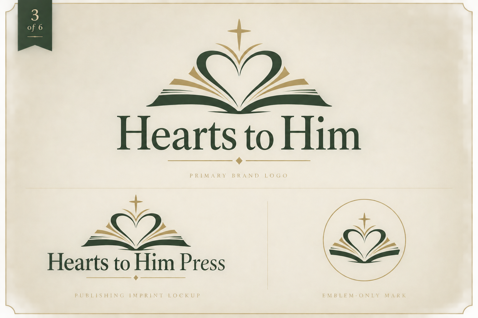
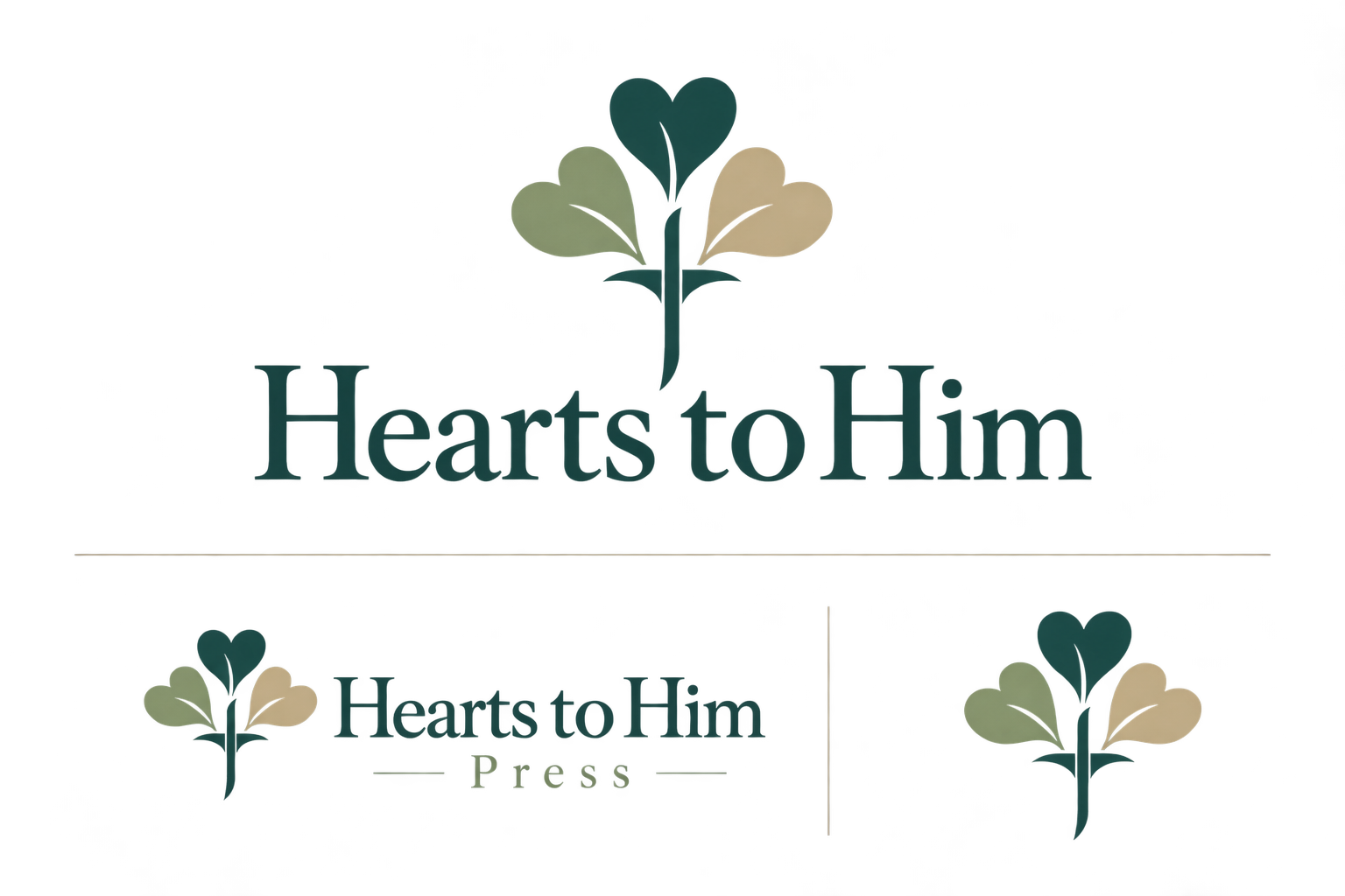
A heart being drawn toward Christ
The logo joins a human heart and the cross in one continuous movement. The heart represents the reader—their faith, questions, relationships, hopes, and desire to know God more personally. The cross gives the mark direction. It makes clear that this is not generic inspiration; every message is intended to lead the heart toward Jesus.
The symbol communicates the mission before the reader opens the first book: every heart is invited into a closer relationship with Him.
Why the red matters
The burgundy is grounded in the red-letter tradition of Scripture, where the spoken words of Jesus appear in red. That makes the color more than an aesthetic choice. It represents the voice of Christ at the center of the brand—the words readers are invited to hear, trust, and live.
The deeper tone avoids the commercial energy of a bright red. It feels mature, reverent, literary, and enduring while carrying associations of love, sacrifice, courage, and devotion.
The continuous line
The heart and cross are not separate pieces. They belong to one another. The continuous line represents relationship: faith woven into prayer, family life, fatherhood, forgiveness, growth, and everyday decisions. The lower loop suggests continuity and eternity—the possibility that one transformed heart can influence a family for generations.
Warmth and illumination
The copper and blush tones soften the burgundy and bring humanity to the identity. They evoke candlelight, well-loved books, craftsmanship, and the warmth of encouragement. Against ivory, the mark feels hopeful and approachable—gentle enough for family and children’s content, yet sophisticated enough for Christian nonfiction.
A brand designed to expand
Hearts to Him is not limited to a single title. The identity can carry books about a relationship with Jesus, prayer, fathers and children, and stories for young readers. The main wordmark works for the author platform; the Press lockup belongs naturally on title pages, book spines, copyright pages, catalogs, and future releases.
Overall positioning
The finished identity should feel Christ-centered, honest, warm, spiritually meaningful, and professionally published. It carries strength for fathers and families, gentleness for children and new believers, and enough credibility to grow into a lasting publishing company.